Johney Zheng Jan 22, 2019 2019-01-22T22:56:24+08:00
Aug 21, 2021 2021-08-21T14:06:13+08:00 11 min
参考网页
动态图没法动态显示,动态显示效果可参考本人工程
Introduction:
- Principal Component Analysis (PCA) –Unsupervised, liner method
- Linear Discriminant Analysis (LDA) –Supervised, liner method
- t-distributed Stochastic Neighbour Embedding (t-SNE) –Nonlinear, probabilstic method
1
2
3
4
5
6
7
8
9
10
11
12
| import numpy as np # linear algebra
import pandas as pd # data processing, CSV file I/O (e.g. pd.read_csv)
import plotly.offline as py
py.init_notebook_mode(connected=True)
import plotly.graph_objs as go
import plotly.tools as tls
import seaborn as sns
import matplotlib.image as mpimg
import matplotlib.pyplot as plt
import matplotlib
%matplotlib inline
|
1
2
3
4
| # import the 3 dimensionality reduction methods
from sklearn.manifold import TSNE
from sklearn.decomposition import PCA
from sklearn.discriminant_analysis import LinearDiscriminantAnalysis as LDA
|
MNIST Dataset
1
2
| train = pd.read_csv('../input/train.csv')
train.head()
|
| label | pixel0 | pixel1 | pixel2 | pixel3 | pixel4 | pixel5 | pixel6 | pixel7 | pixel8 | ... | pixel774 | pixel775 | pixel776 | pixel777 | pixel778 | pixel779 | pixel780 | pixel781 | pixel782 | pixel783 |
|---|
| 0 | 1 | 0 | 0 | 0 | 0 | 0 | 0 | 0 | 0 | 0 | ... | 0 | 0 | 0 | 0 | 0 | 0 | 0 | 0 | 0 | 0 |
|---|
| 1 | 0 | 0 | 0 | 0 | 0 | 0 | 0 | 0 | 0 | 0 | ... | 0 | 0 | 0 | 0 | 0 | 0 | 0 | 0 | 0 | 0 |
|---|
| 2 | 1 | 0 | 0 | 0 | 0 | 0 | 0 | 0 | 0 | 0 | ... | 0 | 0 | 0 | 0 | 0 | 0 | 0 | 0 | 0 | 0 |
|---|
| 3 | 4 | 0 | 0 | 0 | 0 | 0 | 0 | 0 | 0 | 0 | ... | 0 | 0 | 0 | 0 | 0 | 0 | 0 | 0 | 0 | 0 |
|---|
| 4 | 0 | 0 | 0 | 0 | 0 | 0 | 0 | 0 | 0 | 0 | ... | 0 | 0 | 0 | 0 | 0 | 0 | 0 | 0 | 0 | 0 |
|---|
5 rows × 785 columns
Pearson Correlation Plot(威尔逊相关系数)
1
2
3
| # 先把标签数据从数据库中分离出来
target = train['label']
train = train.drop("label", axis=1)
|
1. PCA
Calculating the Eigenvectors
1
2
3
4
| # Standardize the data
from sklearn.preprocessing import StandardScaler
X = train.values
X_std = StandardScaler().fit_transform(X)
|
1
2
3
4
5
6
7
| /usr/local/lib/python3.5/dist-packages/sklearn/utils/validation.py:595: DataConversionWarning:
Data with input dtype int64 was converted to float64 by StandardScaler.
/usr/local/lib/python3.5/dist-packages/sklearn/utils/validation.py:595: DataConversionWarning:
Data with input dtype int64 was converted to float64 by StandardScaler.
|
1
2
3
4
5
6
7
| # Calculating Eigenvectors and eigenvalues of Cov matrix
mean_vec = np.mean(X_std, axis=0)
cov_mat = np.cov(X_std.T)
eig_vals, eig_vecs = np.linalg.eig(cov_mat)
# Create a list of (eigenvalue, eigenvector) tuples
eig_pairs = [(np.abs(eig_vals[i]), eig_vecs[:,i])
for i in range(len(eig_vals))]
|
1
2
3
4
5
6
7
8
| # Sort the eigenvalue, eigenvector pair from high to low
eig_pairs.sort(key=lambda x: x[0], reverse=True)
# Calculation of Explained Variance(可解释方差) from the eigenvalues
tot = sum(eig_vals)
# Individual explanined variance(个体可解释方差)
var_exp = [(i/tot)*100 for i in sorted(eig_vals, reverse=True)]
# (累积可解释方差)
cum_var_exp = np.cumsum(var_exp)
|
1
2
3
4
5
6
7
8
9
10
11
12
13
14
15
16
17
18
19
20
21
22
23
24
25
26
27
28
29
30
31
32
| # Use Plotly visualisation package
# To produce an interactive chart (互动图)
trace1 = go.Scatter(
x = list(range(784)), # 28*28
y = cum_var_exp,
mode = 'lines+markers',
name = "'Comulative Explained Variance'",
# hoverinfo = cum_var_exp,
line = dict(
shape = 'spline',
color = 'goldenrod'
)
)
trace2 = go.Scatter(
x = list(range(784)),
y = var_exp,
mode = 'lines+markers',
name = "'Individual Explanined Variance'",
# hoverinfo = cum_var_exp,
line = dict(
shape = 'linear',
color = 'black'
)
)
fig = tls.make_subplots(insets=[{'cell': (1,1), 'l':0.7, 'b':0.5}],print_grid=True)
fig.append_trace(trace1, 1, 1)
fig.append_trace(trace2, 1, 1)
fig.layout.title = 'Explained Variance plots - Full and Zoomed-in'
fig.layout.xaxis = dict(range=[0, 80], title='Feature columns')
fig.layout.yaxis = dict(range=[0, 60], title='Explained Variance')
py.iplot(fig, filename='inset example')
|
1
2
3
4
5
6
7
|
This is the format of your plot grid:
[ (1,1) x1,y1 ]
With insets:
[ x2,y2 ] over [ (1,1) x1,y1 ]
|

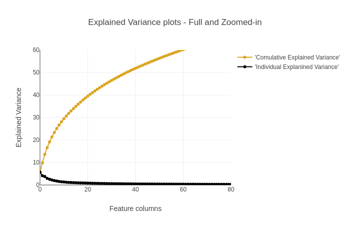
上图累计解释方差图可知874个数据,利用其中的200个数据便构成了90%的累积方差。所以在特征降维的过程中,只提取得到该200个特征便可以一定程度上替代整个样本。
Visualizing the Eigenvalues
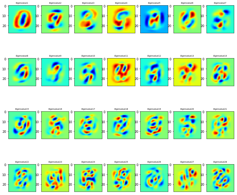
采用了sklearn从dataset中提取30 eigenvalues,并且可视化比较最高的28个eigenvalues
1
2
3
4
5
6
7
8
| # Invoke Sklearn's PCA method
n_components = 30
pca = PCA(n_components=n_components).fit(train.values)
eigenvalues = pca.components_.reshape(n_components, 28, 28)
# Extract the PCA components (eigenvalues)
eigenvalues = pca.components_
|
1
2
3
4
5
6
7
8
9
10
11
12
13
14
| n_rows = 4
n_col = 7
# Plot the first 28 eigenvalues
plt.figure(figsize=(13,12))
for i in list(range(n_rows * n_col)):
offset = 0
plt.subplot(n_rows, n_col, i+1)
plt.imshow(eigenvalues[i].reshape(28, 28), cmap='jet')
title_text = 'Eigenvalue' + str(i+1)
plt.title(title_text, size=6.5)
plt.xticks(())
plt.xticks(())
plt.show()
|
从上图可知,特征图的方向演变越来越复杂,以拓展特征空间,扩大特征方差。
Visualsing the MNIST Digit set on its own
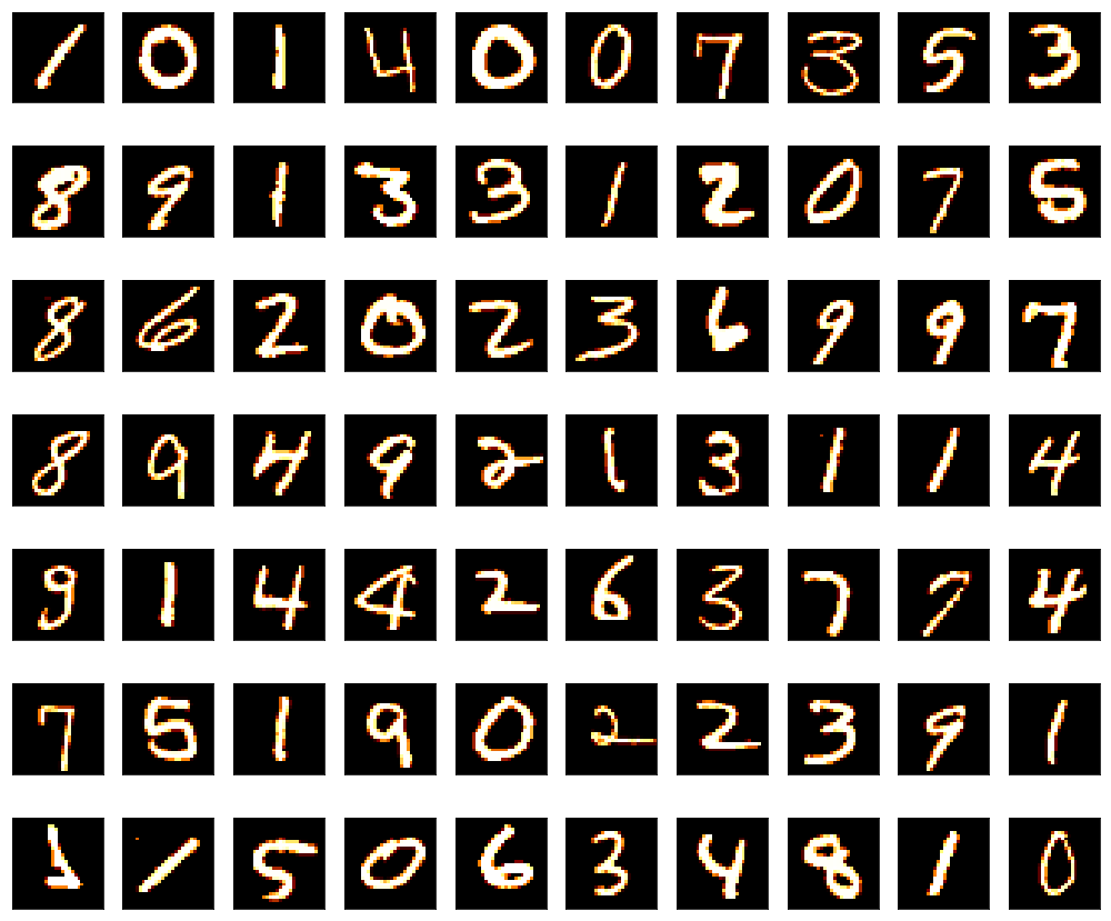
展示实际基础数据集数据
1
2
3
4
5
6
7
8
9
10
| # plot some of the numbers
plt.figure(figsize=(14, 12))
for digit_num in range(0, 70):
plt.subplot(7, 10, digit_num+1)
# reshape from 1d to 2d pixel array
grid_data = train.iloc[digit_num].as_matrix().reshape(28, 28)
plt.imshow(grid_data, interpolation="none", cmap='afmhot')
plt.xticks([])
plt.yticks([])
plt.tight_layout()
|
1
2
3
| /usr/local/lib/python3.5/dist-packages/ipykernel_launcher.py:6: FutureWarning:
Method .as_matrix will be removed in a future version. Use .values instead.
|
PCA Implementation via Sklearn
PCA聚类的关键在于如何选取聚类的components,具体可参考论文,这里选取为5
1
2
3
4
5
6
7
8
9
10
11
12
13
14
15
| # Delete our earlier created X object
del X
# Taking only the first N rows to speed things up
X = train[:6000].values
del train
# Standardsing the values
X_std = StandardScaler().fit_transform(X)
# Call the PCA method with 5 components.
pca = PCA(n_components=5)
pca.fit(X_std)
X_5d = pca.transform(X_std)
# For cluster coloring in our Plotly plots, remember to also restrict the target values
Target = target[:6000]
|
1
2
3
4
5
6
7
| /usr/local/lib/python3.5/dist-packages/sklearn/utils/validation.py:595: DataConversionWarning:
Data with input dtype int64 was converted to float64 by StandardScaler.
/usr/local/lib/python3.5/dist-packages/sklearn/utils/validation.py:595: DataConversionWarning:
Data with input dtype int64 was converted to float64 by StandardScaler.
|
Interactive visualisations of PCA representation
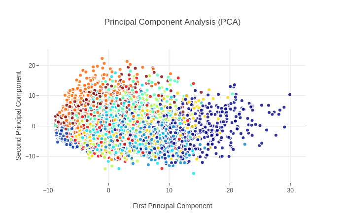
这里只显示前两主成分投影
1
2
3
4
5
6
7
8
9
10
11
12
13
14
15
16
17
18
19
20
21
22
23
24
25
26
27
28
29
30
31
32
33
34
35
36
37
38
39
| trace0 = go.Scatter(
x = X_5d[:, 0],
y = X_5d[:, 1],
mode = 'markers',
text = Target,
showlegend = False,
marker = dict(
size = 8,
color = Target,
colorscale = 'Jet',
showscale = False,
line = dict(
width = 2,
color = 'rgb(255, 255, 255)'
),
opacity = 0.8
)
)
data = [trace0]
layout = go.Layout(
title = 'Principal Component Analysis (PCA)',
hovermode = 'closest',
xaxis = dict(
title = 'First Principal Component',
ticklen = 5,
zeroline = False,
gridwidth = 2,
),
yaxis = dict(
title = 'Second Principal Component',
ticklen = 5,
gridwidth = 2,
),
showlegend = True,
)
fig = dict(data=data, layout=layout)
py.iplot(fig, filename='styled-scatter')
|
PCA属于非监督学习,类别信息是外加的,可以看到类别的分类情况不是特别好
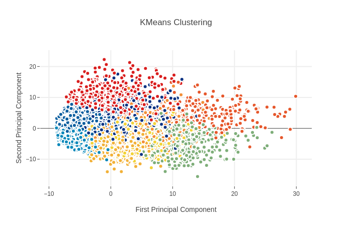
K-Means Clustering to identify possible classes
K-Means可用于PCA非监督学习中的聚类分析,通过点云集中心之间的距离来进行分类 这里显示前两主成分投影的聚类分析结果
1
2
3
4
5
6
7
8
9
10
11
12
13
14
15
16
17
18
19
20
21
22
23
24
25
26
27
28
29
30
31
32
33
34
35
36
37
38
39
| from sklearn.cluster import KMeans # KMeans clustering
# KMeans 中K设置为9
kmeans = KMeans(n_clusters=9)
# Compute cluster centers and predict cluster indices
X_clustered = kmeans.fit_predict(X_5d)
trace_Kmeans = go.Scatter(x=X_5d[:, 0], y=X_5d[:, 1], mode="markers",
showlegend=False,
marker=dict(
size = 8,
color = X_clustered,
colorscale = 'Portland',
showscale = False,
line = dict(
width = 2,
color = 'rgb(255, 255, 255)'
)
))
layout = go.Layout(
title = 'KMeans Clustering',
hovermode = 'closest',
xaxis = dict(
title = 'First Principal Component',
ticklen = 5,
zeroline = False,
gridwidth = 2,
),
yaxis = dict(
title = 'Second Principal Component',
ticklen = 5,
gridwidth = 2,
),
showlegend = True
)
data = [trace_Kmeans]
fig1 = dict(data=data, layout = layout)
py.iplot(fig1, filename='svm')
|
和之前PCA的图相比较可见非监督学习的分类效果不是很好,两者一致性较低
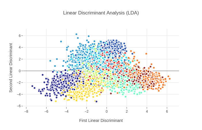
2. Linear Discriminant Analysis (LDA)
LDA的原理在于最大化类间方差,最小化类内方差,可通过散度矩阵进行表达求解
LDA Implementation via Sklearn
LDA model,仍采用5维度
1
2
3
| lda = LDA(n_components=5)
# Taking in as second argument the Target as labels
X_LDA_2D = lda.fit_transform(X_std, Target.values)
|
1
2
3
| /usr/local/lib/python3.5/dist-packages/sklearn/discriminant_analysis.py:388: UserWarning:
Variables are collinear.
|
Interactive visualisations of LDA representation
1
2
3
4
5
6
7
8
9
10
11
12
13
14
15
16
17
18
19
20
21
22
23
24
25
26
27
28
29
30
31
32
33
34
35
36
37
38
39
| # Using the Plotly library again
traceLDA = go.Scatter(
x = X_LDA_2D[:, 0],
y = X_LDA_2D[:, 1],
mode = 'markers',
text = Target,
showlegend = True,
marker = dict(
size = 8,
color = Target,
colorscale = 'Jet',
line = dict(
width = 2,
color = 'rgb(255, 255, 255)'
),
opacity = 0.8
)
)
data = [traceLDA]
layout = go.Layout(
title = 'Linear Discriminant Analysis (LDA)',
hovermode = 'closest',
xaxis = dict(
title = 'First Linear Discriminant',
ticklen = 5,
zeroline = False,
gridwidth = 2,
),
yaxis = dict(
title = 'Second Linear Discriminant',
ticklen = 5,
gridwidth = 2,
),
showlegend = False
)
fig = dict(data=data, layout=layout)
py.iplot(fig, filename='styled-scatter')
|
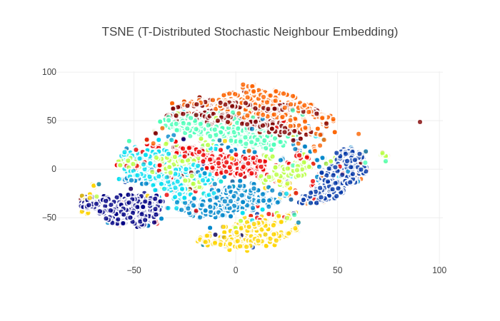
3. T-SNE(t-Distributed Stochastic Neighbour Embedding)
t分布以条件分布来解决分类问题
1
2
3
| # Invoking the t-SNE method
tsne = TSNE(n_components=2)
tsne_results = tsne.fit_transform(X_std)
|
1
2
3
4
5
6
7
8
9
10
11
12
13
14
15
16
17
18
19
20
21
22
23
24
25
26
27
28
29
30
31
| traceTSNE = go.Scatter(
x = tsne_results[:, 0],
y = tsne_results[:, 1],
# name = Target,
# hoveron = Target,
mode = 'markers',
text = Target,
showlegend = True,
marker = dict(
size = 8,
color = Target,
colorscale = 'Jet',
showscale = False,
line = dict(
width = 2,
color = 'rgb(255, 255, 255)'
),
opacity = 0.8
)
)
data = [traceTSNE]
layout = dict(title = 'TSNE (T-Distributed Stochastic Neighbour Embedding)',
hovermode = 'closest',
yaxis = dict(zeroline = False),
xaxis = dict(zeroline = False),
showlegend = False,
)
fig = dict(data=data, layout=layout)
py.iplot(fig, filename='styled-scatter')
|
从图中可以看出TSNE算法的类间分离效果较好,优于之前的PCA和LDA算法,这要归结于算法的拓扑保留特性 TSNE算法的缺点在于可能存在多个局部最小值,图中可看出有相同颜色的子簇被分离到了两块不同的区域
4.总结
这里简单总结了几种常见的降维方法,包括:PCA(+KMeans),LDA,TSNE 还有一些其他的降维方案,包括:Sammon映射、多维缩放、以及一些基于图的可视化方法